Page 1 of 1
Logo design
Posted: Thu Dec 21, 2006 5:40 pm
by breaksRbest
tell us what you think of the logo for Fire:Aid?
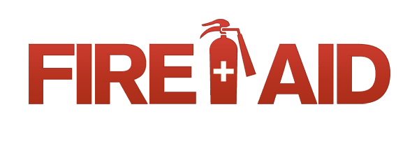
keep in mind that we need to keep it fairly simple as it will be used for a whole lotta different things (including tee shirts etc)
(Thanks to valuetime for putting it together)
Posted: Thu Dec 21, 2006 5:46 pm
by valuetime
well, i like it. especially the subtle web 2.0 shading.
Posted: Thu Dec 21, 2006 6:42 pm
by fooishbar
lower-case, maybe? (that's even more web 2.0.) or maybe just a different font. the text isn't grabbing me, tbh.
Posted: Thu Dec 21, 2006 6:58 pm
by lynt
arial bold italic

Posted: Thu Dec 21, 2006 7:00 pm
by fooishbar
comic sans ms or gtfo/stfu/zomg/aimbot.
Posted: Thu Dec 21, 2006 8:01 pm
by system
I like the iconography and colour.

A condensed cut of the logotype would work better IMO, Dave. (Web 2.0 design requires keylines too.

)
Posted: Thu Dec 21, 2006 10:12 pm
by valuetime
akzidenz grotesk ftw.
Posted: Fri Dec 22, 2006 2:01 am
by breaksRbest
uuuuuuuummmmm, I have no idea what you're talking about.
do you like it or not?
Posted: Fri Dec 22, 2006 5:06 am
by valuetime
akzidenz grotesk is the typeface used here. as you can clearly see, it shits all over similar typefaces:

Posted: Fri Dec 22, 2006 7:10 pm
by quick
nerds... lol
Posted: Fri Dec 22, 2006 7:13 pm
by valuetime
post count.
Posted: Fri Dec 22, 2006 7:15 pm
by fooishbar
valuetime wrote:akzidenz grotesk is the typeface used here. as you can clearly see, it shits all over similar typefaces:
the typeface is nice, it's just the IMPOSING ALL CAPS BIT. it's a bit 'FIRE AID, MOTHERFUCKER'.
Posted: Sat Dec 23, 2006 8:20 am
by system
breaksRbest wrote:uuuuuuuummmmm, I have no idea what you're talking about.
do you like it or not?
Yessir!
(:lol:)
Posted: Sat Dec 23, 2006 1:29 pm
by ghetto kitty
fooishbar wrote:valuetime wrote:akzidenz grotesk is the typeface used here. as you can clearly see, it shits all over similar typefaces:
the typeface is nice, it's just the IMPOSING ALL CAPS BIT. it's a bit 'FIRE AID, MOTHERFUCKER'.
agree...
the font aint doin much for me, but i like the logo...
Posted: Sat Dec 23, 2006 7:31 pm
by drew
i think possibly the '+' to be a bit for a focus as well cause the type is a little too overpowering
Posted: Sun Dec 24, 2006 10:35 am
by Lauer
Maybe the fire extinguisher as the "I"?
Posted: Sun Dec 24, 2006 8:47 pm
by Andrez
fooishbar wrote:it's a bit 'FIRE AID, MOTHERFUCKER'.
...cool!!!

I like it!!
Posted: Mon Dec 25, 2006 10:15 am
by Blaxter
Lauer wrote:Maybe the fire extinguisher as the "I"?
Definitely agreed. Thats the first thing I thought when I saw it between the two words.
Posted: Thu Jan 04, 2007 3:37 am
by Lós Kasino—
I had a few attempts at some designs if it can contribute anything / or if anyone would like to comment ??
flames:

expo 88 style:

Posted: Thu Jan 04, 2007 7:02 am
by system
Lós Kasino— wrote:I had a few attempts at some designs if it can contribute anything / or if anyone would like to comment ??
Just as a gentle reminder:
breaksRbest wrote:keep in mind that we need to keep it fairly simple as it will be used for a whole lotta different things (including tee shirts etc)
Simple means keeping the amounts of colours to nearly monotone and the shapes to those that can be reproduced easily at a range of different sizes.

Posted: Thu Jan 04, 2007 10:27 am
by deviant
I like it the way it is

Posted: Thu Jan 04, 2007 12:51 pm
by Lós Kasino—
yea thats cool - just throwin some ideas out there.
Posted: Fri Jan 05, 2007 6:34 pm
by breaksRbest
Lauer wrote:Maybe the fire extinguisher as the "I"?
quite a few people have suggested this
Posted: Fri Jan 05, 2007 6:47 pm
by deviant
which "I"? the one in "fire" or the one in "aid"?
or
wait for it
both
Re: Logo design
Posted: Mon Jan 08, 2007 11:33 am
by DBoy
breaksRbest wrote:tell us what you think of the logo for Fire:Aid?
keep in mind that we need to keep it fairly simple as it will be used for a whole lotta different things (including tee shirts etc)
(Thanks to valuetime for putting it together)
Can we use the bandaids like last time? Keep the theme going?
Posted: Mon Jan 08, 2007 11:40 am
by gnat
extinguisher as the i yes
and i like lower case too
apparently upper case is not as easily distinguished by our brains. i heard that somewhere once
but really i just like lower case
nice work!
and one more thing, do you reckon something representative of the music- like a record on the extinguisher instead of the cross? maybe not, just ideas
Posted: Mon Jan 08, 2007 2:46 pm
by Lizkins
me likes. font ain't totally grabbing me, but still radness
Posted: Thu Jan 11, 2007 9:40 am
by valuetime
i'll try to address all these points without sounding like a jerk:
logo for i: i can't ever see replacing the I with an icon working as well (you guys managed to hit one of my pet peeves!). i did it up quickly anyway to demonstrate. as you can see, the letter spacing gets all wrecked and it becomes slightly less legible. simplicity FTW, i say.

typeface: i chose the typeface because it evokes the bold simplicity of medical kits and fire extinguishers. i've always been an akzidenz slash clarendon man (check
bland,
myspace and the local lineup posters) because they are simple typefaces with lots of character.
uppercase/lowercase: lowercase letters are more varied in height, width and makeup, making them easier to read than uppercase. however, a seven letter logo can be set in uppercase and be bolder and as legible. also, the solid cap height and baseline of the first logo make the extinguisher stand out.
bandaid/cross on logo/record on logo: the extinguisher/cross simply illustrates the event name. putting a record on it would confuse this. the music element could be better conveyed by the flyer. also, beat:aid, i stopped liking the bandaid look because on reflection, to bandaid something is to paper up it's cracks, and not to provide a genuine solution. i thought it could be construed as negative.
i still like the original, so i say that since no one really hates it, why not use it? the poster art will be as/more important than the logo anyway, and i guarantee that if you put this on a flyer, people will either go "wow, cool" or simply "meh" but will be blown away by the artists or event as a whole. very rarely would people not go to something because the flyer sucked (virus still sells records even with that shoddy 3D look they've been using for years).
so anyway, that's my thoughts.
Posted: Thu Jan 11, 2007 9:43 am
by breaksRbest
well said Dave
Posted: Thu Jan 11, 2007 12:40 pm
by system
valuetime wrote:i say that since no one really hates it, why not use it? the poster art will be as/more important than the logo anyway

breaksRbest wrote:well said Dave
Roll it out!
Posted: Thu Jan 11, 2007 3:31 pm
by DBoy
valuetime wrote:
bandaid/cross on logo/ illustrates the event name. i stopped liking the bandaid look because on reflection, to bandaid something is to paper up it's cracks, and not to provide a genuine solution. i thought it could be construed as negative.
so anyway, that's my thoughts.
I think that this "deeper" analysis of the use of the band aid on the logo instead of the cross is exactly that, over analitical. I can not imagine anyone percieving the event as a quick-fix-solution because we have used a band aid on the flier and logo, eitheer before the event or in retrospect.
The main reason i suggest we use it is to have a common theme between the last event and this one, and for any future ones.
Looking at the beat.aid flier it did not actually use the band aid that much, maybe there is another way to tie them together? once we do the flier maybe?

Posted: Thu Jan 11, 2007 4:27 pm
by breaksRbest
we'll chuck a couple of band aids on the flier for ya
Posted: Thu Jan 11, 2007 4:37 pm
by DBoy
thats me satisfied, even if they are only real band-aids and only on the flier i get.
Logo is locked and loaded, good gob Valuetime!
D>
Posted: Mon Jan 15, 2007 11:06 pm
by Blaxter
Nice work Dave, even though you stuck to you're guns, I hardly think I would be any different in my attitude if the tabels were turned. You have obviously put a lot of thought and your own time into comeing up with art worl/ logo ideas.
Maybe in the future, as a suggestion, don't waste time asking for suggestions. A good designer is just that, armchair critics are just cowboys. Oh and I'm a dirty bogan.
But don't mind me. Top effort there bro.
Posted: Wed Jan 17, 2007 2:43 pm
by Spherix
i like the virus logo

Posted: Wed Jan 17, 2007 3:36 pm
by valuetime
nothing wrong with their logo...